Bloomberg Iconography
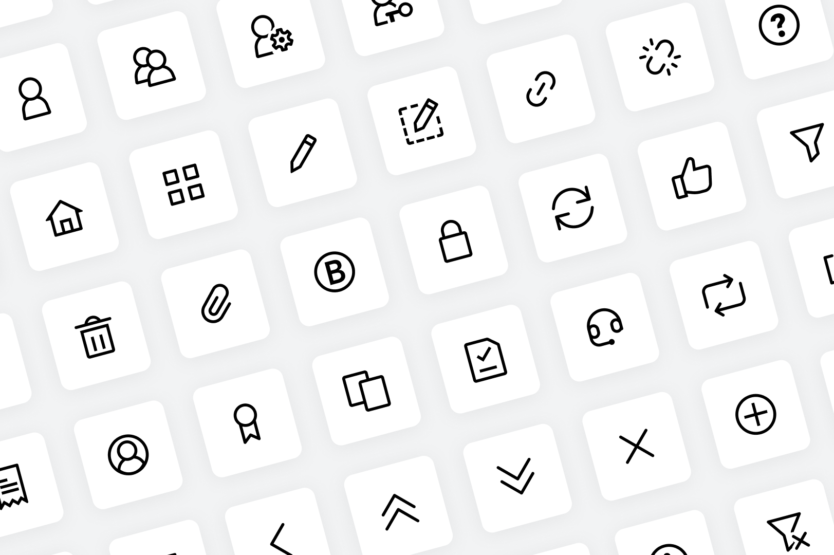
As part of a system-wide design refresh, I supported the redesign of Bloomberg’s Crescent icon library — an initiative to unify visual language across Bloomberg’s terminal, web and mobile products. Over six weeks, I developed over 180+ icons that prioritized pixel precision, cross-platform consistency and theme adaptability.
Challenge
The project required balancing strict constraints: designing within a tight six-week timeline, reconciling inconsistencies across legacy icon sets, and maintaining user familiarity in a highly recognizable product ecosystem. Over time, Bloomberg’s icons had been created by different teams, often without a centralized system, resulting in visual drift and brand inconsistency. This effort demanded a careful audit of existing assets, the consolidation of overlapping concepts, and the development of a unified visual language. Each icon needed to function at small sizes (primarily 16x16), scale up gracefully, and work seamlessly across both light and dark themes. The greatest challenge was modernizing Bloomberg’s iconography without disrupting the trusted visual patterns relied on by long-time terminal users.

Approach
I explored icon concepts, refined and redrew assets, and created new icons using a 16x16 grid with a 1px margin for optimal clarity and balance. Icons were optimized for multiple resolutions (16x16, 24x24, 32x32, 48x48) and themed for light and dark interfaces. Extra care was taken with corner radiuses, pixel alignment, and spacing for visual sharpness at scale.


Impact
This work laid the groundwork for consistent, scalable iconography across Bloomberg’s platforms. By aligning web, mobile, and terminal icon sets under a shared system, the Crescent icon library elevated both usability and brand coherence—while honoring the visual familiarity essential to Bloomberg’s long-time user base.
